Being interested in remote work and having met a fair number of digital nomads/remote workers in my travels, I decided to look for data on internet speed by country and cost of living. I have actually used Numbeo’s very user-friendly and informative Cost of Living data on their website in the past and had recently shared it with a friend. I also recalled looking up data on internet speeds around a year ago (while in Romania, a country at one point in the not-too-distant past famous for having nearly the fastest internet in the world AND a low cost of living!) At the time, it didn’t take us long to find that Wikipedia has a list of countries by internet connection speeds, and this was what led me to Akamai’s State of the Internet Connectivity Report for Q1 2017.
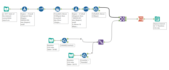
I copied and pasted the Numbeo table (using the most recent data, which was for 2018) into an Excel spreadsheet, but the Akamai data proved more difficult to work with, coming in a pdf table over 2 pages, but copying it did not preserve the table formatting. The easiest method I could find turned out to be to use Tableau 10.5’s “Import from pdf” functionality to bring the table in to Tableau, then export it to a CSV. I then imported the CSV into Alteryx, joined it to the Numbeo spreadsheet, did a bit of data cleanup, then output it to a TDE all ready to play with in Tableau.
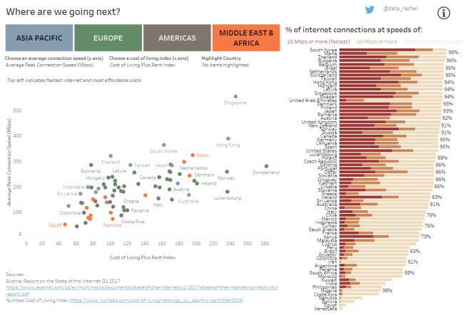
The initial data I was interested in (cost of living vs. internet speed by country) lent itself well to a scatterplot. It also came with different ways of looking at cost of living, as well as data on both average connection speed and average peak connection speed. I liked the idea of giving the user the choice of which factors to look at and to be able to explore the data in this way, so I used parameters to enable swapping out the axes. The data also came with regional indicators, so I thought this would also be useful as filters for the user. At the same time, I liked being able to see all the data at once (before the filter is applied) and was interested to see if there would be any geographical clustering (e.g. is one region much more “digital nomad friendly” than another, i.e. with faster internet and lower cost of living)?
The answer turned out to be generally no. And in fact for all regions (and the world), a correlation can be seen between cost of living and internet speed, with the exception of Europe, where there appear to be both better bargains to be found and far more expensive places to live with slower internet than the mean! The different indices are quite interesting to explore as well, and the “Highlight Country” field allows the user to focus on one country and seeing how it moves relative to its neighbours (or the world) along different cost of living indices. Details of the various indices from the Numbeo site are available by hovering over the information icon in the top right corner.
Finally, along the right hand side of the viz is a stacked bar chart showing the internet connection speeds that have been accessed by each country on average. This sort of ties in with the “average internet speed” vs “average peak internet speed” toggle of the y-axis on the scatterplot. It’s all very well knowing that breakneck internet speeds are available in a country, but they may only be available in certain parts of the country, or to certain people, or at a very high price. All or any of which may mean they are potentially not readily available to you! And you may not discover this until you arrive! The chart on the right shows internet connection speeds that have been recorded in each country, with darker shades indicating faster connection speeds and the total length of the bar indicates what percentage of connections have connected at a speed of at least 4 Mbps.
I would have liked to have had the legend be clickable so that the user could then sort the bars by the different speeds for ease of understanding, but I’m not sure that is currently possible, especially with keeping the formatting of having the font colours as a legend.
Please explore the viz and maybe it will help you choose your next working destination!